Improving Information Architecture at Scotiabank
Role: Product Designer in a team of 2
Duration: 2 months
Problem:
We had the challenge of redesigning our profile & settings tab, while adding features to our app was great, the Settings section was not designed with scalability in mind.
You can think of it as the last drawer of your kitchen, where you put everything you don’t know where else to put.
Assessing where we were
Before we did any work, this is what the “Más” (Profile & Settings) looked like. As you can see from the highlighted areas, tabs were mixed with no hierarchy, making for an unorganized, hard to navigate, long page.
First comes understanding
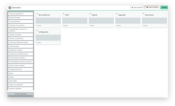
Set out to understand our users mental model, we conducted a Card Sorting activity using Optimal Workshop.
20
Participants
45
Minutes per Interview
Categories included:
Profile
Support
Safety
Documents
Settings
I don’t know where I would put it (optional)
2 optional open categories
5
Participants per profile
A screenshot of OptimalSort, where we conducted the activities
Findings
We then download all findings and results from the activities, we compared how different profiles organized cards based on how they used the product, and the context of it.
Mobile users had different results than desktop only users who were more traditional in the sense they stuck with proposed categories and wanted more options on the screen. This was expected given how much space a computer has over a phone.
After doing peer reviews with other designers and discussing it with our Product team, we settled on a nuanced version of findings, that way we made sure to reduce friction points for all types of users
Final results - Each purple box represents a cluster
Prototyping
A screenshot of the Figma file
We then started prototyping using our new architecture. Using previous clusters as the Design Principle for this project, we included every needed scenario and how navigation should work, for our development team to start building it.
Final Results
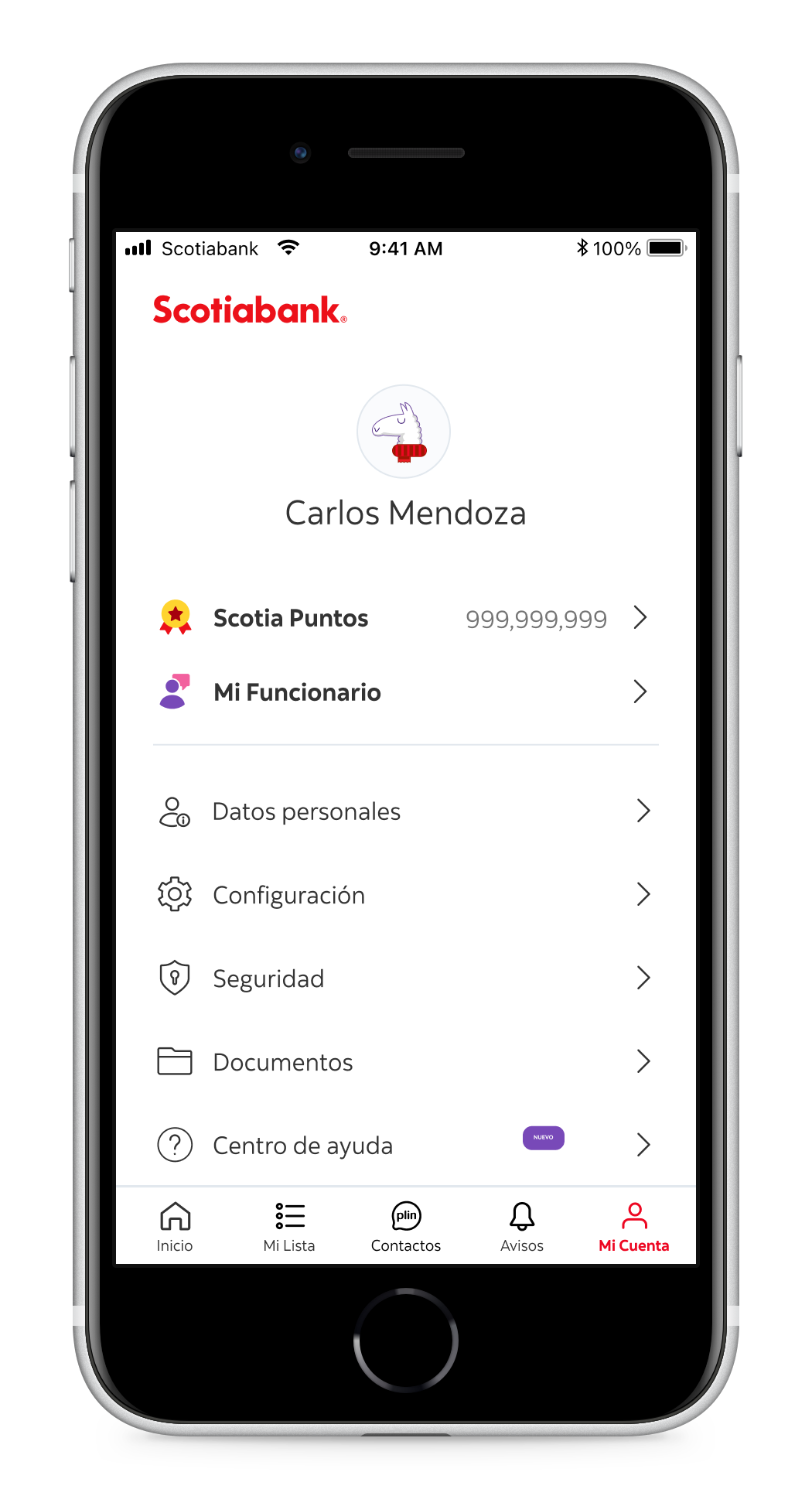
Mi Cuenta
What was previously called ‘Más’ (Spanish for More) was renamed to My Account, so users would know without having to enter, that this section is where they would find everything account related. (And not pre approved products as Fernanda told us:
“I feel that in ‘Más’ I’ll be offered new pre approved products or offers.”
Bringing order in the messy tab
Mi Cuenta’s main view included access to all clusters we reviewed previously, allowing users to dive into what they needed, and allowing the app to scale smoothly.
Web friendly too
Changes made on the app were also brought to Scotiabank’s website, ensuring consistency and further improving users ease of use by having a seamless, channel-agnostic experience.
Takeaways
Working on this project meant long hours, over two months of interviewing and constant back and forth with our development team.
An enriching experience where I personally learned a ton.
My main takeaway is the importance of building solid foundations when creating a new digital product, so you know how to scale it correctly. Always think of the future design team and what challenges they might face with the decisions you make today. Read more about my take on designing for the future here.
Portfolio
-
Work at Zumba
Become an Instructor Improvements | Case Study
-
Work at Scotiabank
Credit Card Claims | Case Study


