Zumba’s “Become an Instructor” Improvements
Overview
When working at Zumba, I had the challenge of improving our current ‘Instructor Site’ to help increase its conversion, the surface level problem was low conversion numbers.
Role & Duration
Designer + Researcher
Research, Synthesis, Ideation, Prototyping and Testing.
2022
At ZINCON Recording Studio where I spoke with instructors after they finished recordings.
First comes discovering
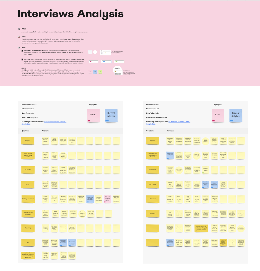
I started talking to users, to deep dive into their Instructor journey, to discover what blockers, drivers and what role Zumba had in their lives. Research took place at 2022 ZINCON.
Crafting Understanding
After conducting interviews with 10 instructors, I started clustering and sorting findings that led to insights.
Unveiling Perspectives
Three major insights were the ones that came out of the Research process.
1
Instructors often had fear at first, but then found teaching delightful as they started.
3
There is a ‘front-row diva’ (referring to advocate students) competition to be noticed in class, meaning there was a missed opportunity to turn front row divas into instructors.
2
At a first glance, instructors recalled having a hard time finding the step by step and information needed to take their first level training. (B1)
Ideation
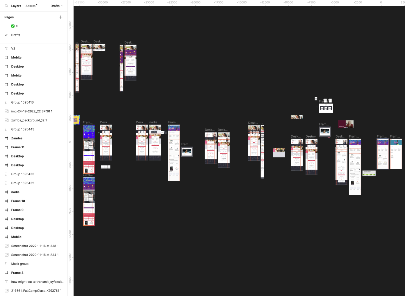
Turning insights into How Might We’s, then I started doing comp-analysis and ideation to land into a new ‘Become an Instructor’ page.
Solution
The solution I designed needed to solve 3 design challenges
Make it clear what the main action is
Step-by-step section on how to do it
Communicate the joy of being an instructor
How might we clearly emphasize the primary action?
During the evaluation of the legacy 'Become an Instructor' page, it became evident that its layout was overly cluttered. The page featured a total of four distinct options: 'Offers,' 'Register,' 'Watch Video' link, and a 'Play' button.
Additionally, Zumba’s brand is based around happiness and joy which this page does not communicate.
Legacy ‘Become an Instructor’ hero section
A Revamped Hero Section
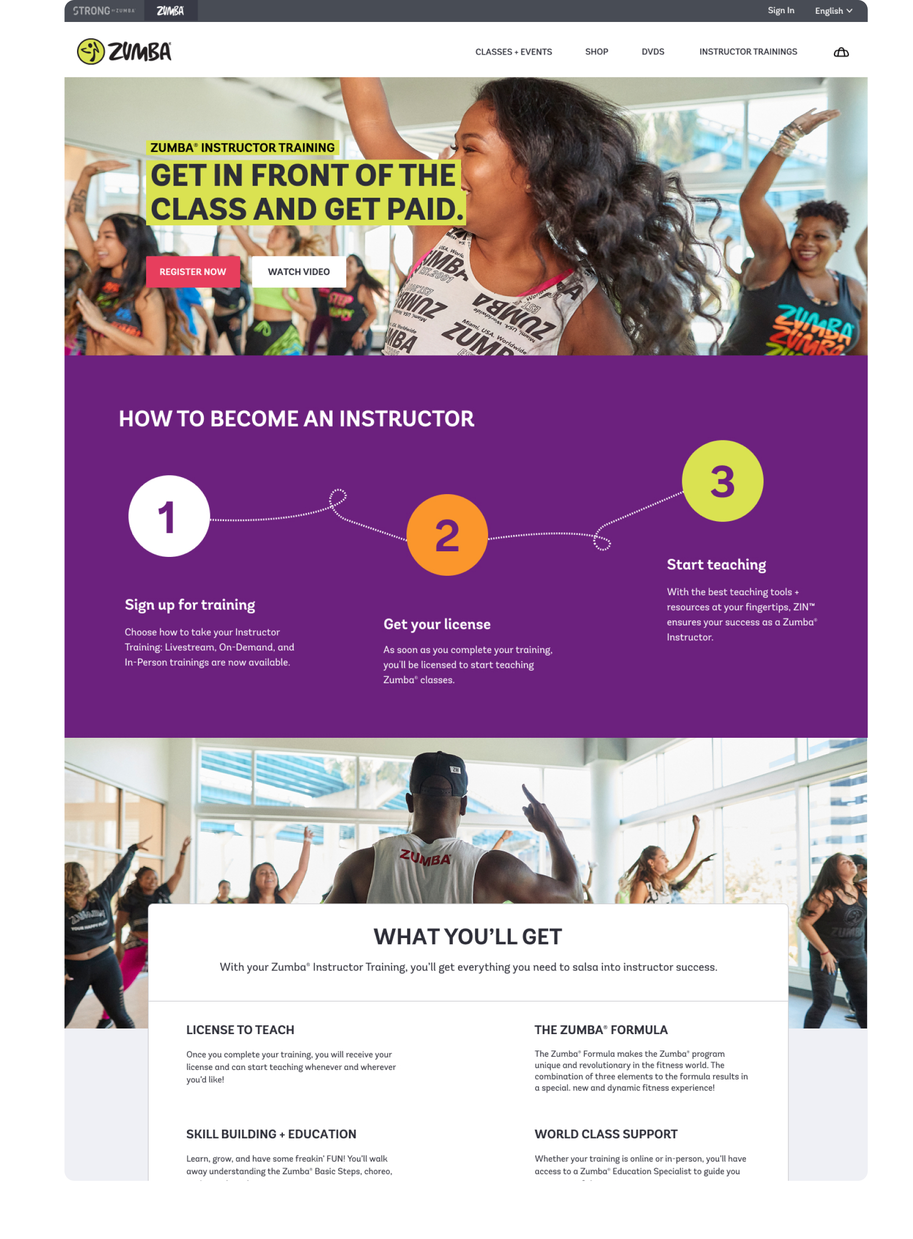
When redesigning this section, my focal point was on creating a more streamlined hero section. This entailed highlighting two core actions: primarily, the prominent 'Register Now' button took center stage, accompanied by the secondary option, 'Watch Video.'
The title subtly incorporated the 'front-row-diva' concept we delved into earlier, by mentioning a get noticed and paid concept. Imagery used was also renewed to convey happiness, the core of the brand.
How might we further enhance clarity of the Becoming an Instructor process for instructors seeking guidance?
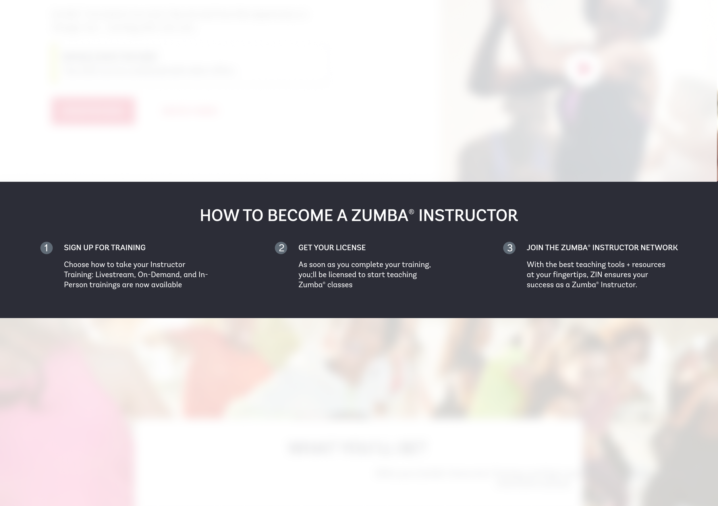
One of the main things I noticed right away was that the ‘How to’ section was too small and plain, that’s one of the most important sections in the page! There was also upsell happening here, I believe you should first have people on board and then try to upsell them.
So I knew it had to be obvious that this are steps towards becoming an Instructor
Legacy Step-by-Step section
Road to teaching
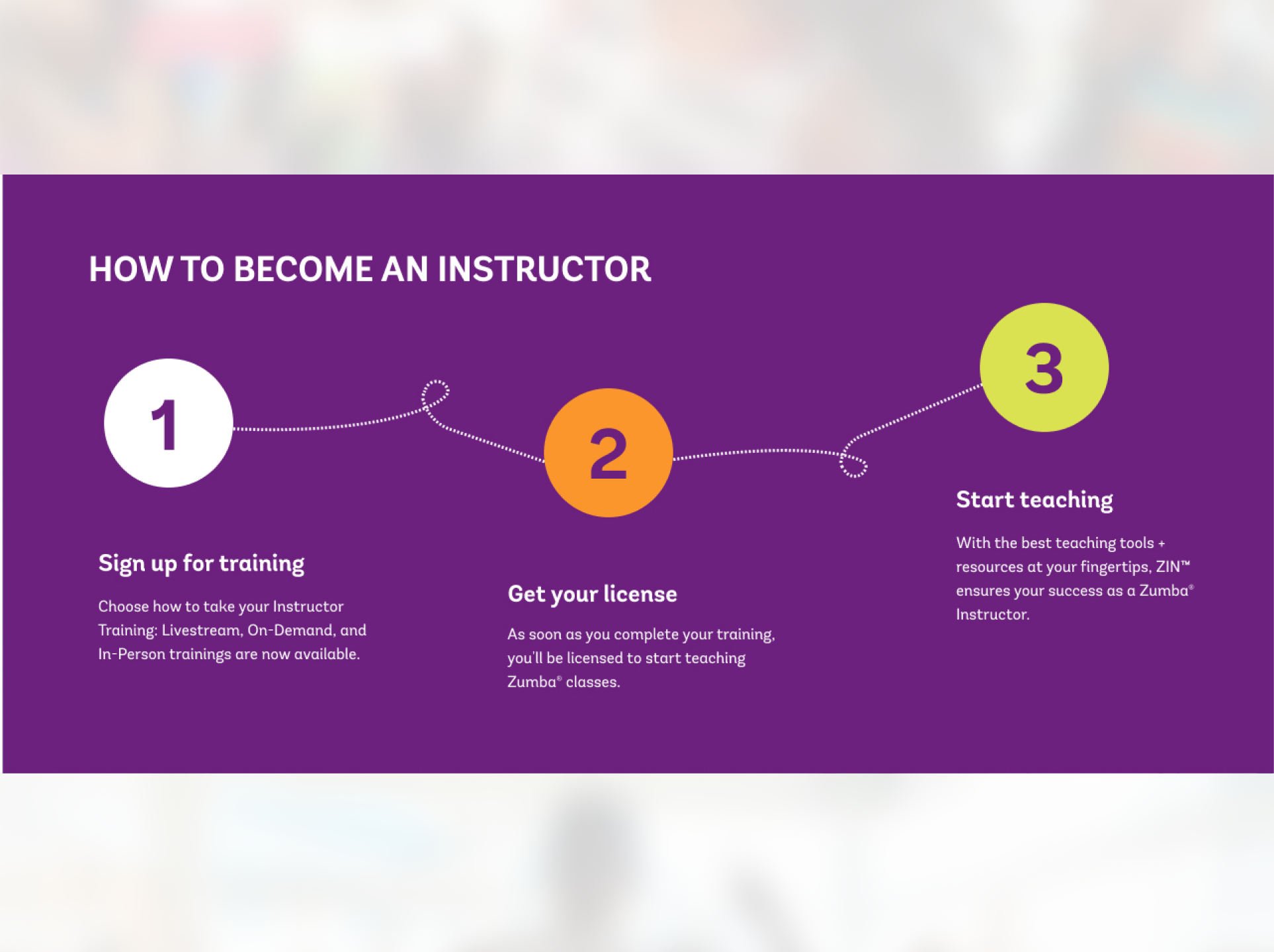
Gone are the upselling efforts (on this page) and I changed the approach to just focus on starting teaching Zumba.
Leveraging on the playfulness of the brand, I increased the size of the section, added some color, and more importantly, made it clear what needed to be done to get your License and start teaching.
Redesigned Step-by-Step section
How might we communicate the joy of being an Instructor?
This is the whole redesign I did, throughout the page, we went from plain and disperse content on the previous page to a more clear, actionable and fun page.
Legacy ‘Become an Instructor’ page
A/B Testing
This is an ongoing project so now we’re conducting A/B tests to review which performs better.
So far, with improvements made, site has seen an increase of 7% of conversion.
New, redesigned ‘Become an Instructor’ page
Bringing it all together
This redesign took 4 months to complete, between research, synthesis, ideation and prototyping.
The most challenging to me was communicating joy and happiness through visual design, and one that turned to be great and successful. Having impact on business indicators was truly rewarding for me.
Portfolio
-
Case Study at Scotiabank
Credit Card Claims | Case Study
-
Work at Scotiabank
A selection of work I did at Scotiabnk


